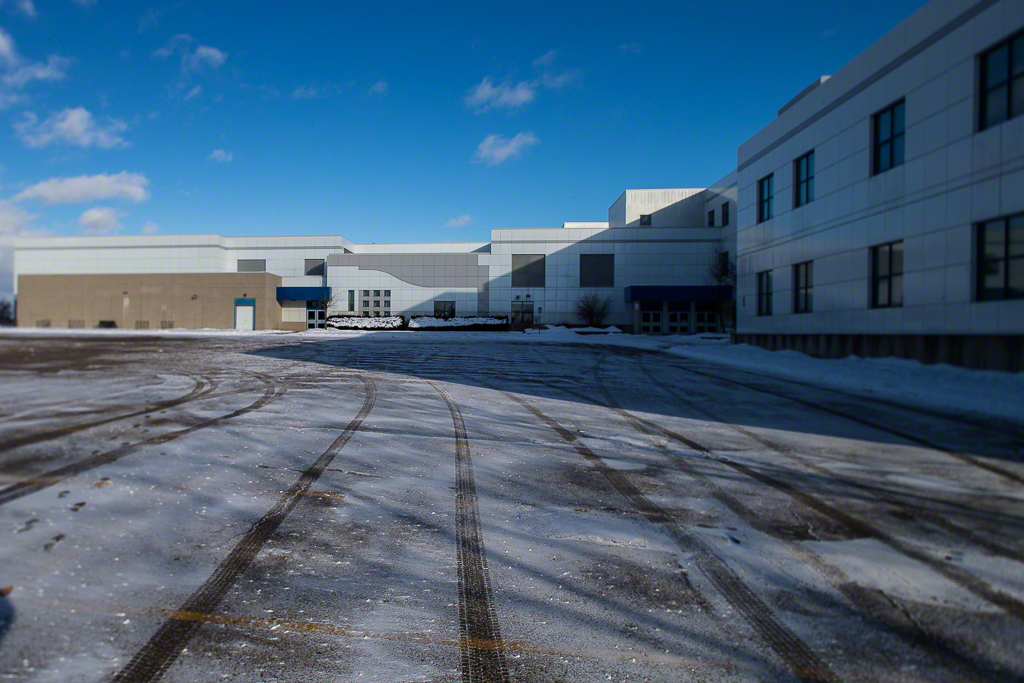
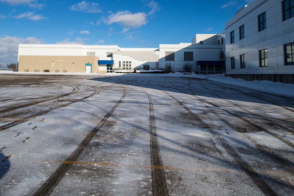
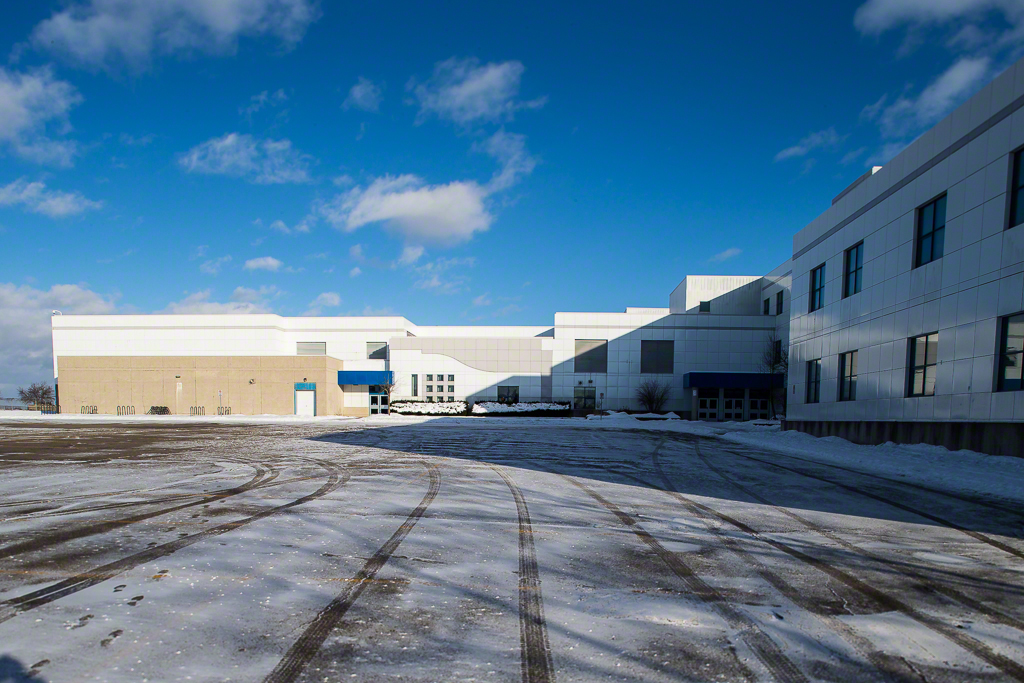
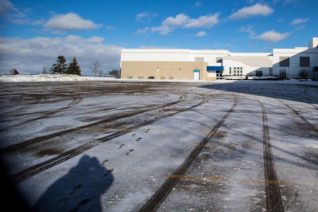
Lens Compression and Perspective Exaggeration

Lens Compression and Perspective Exaggeration

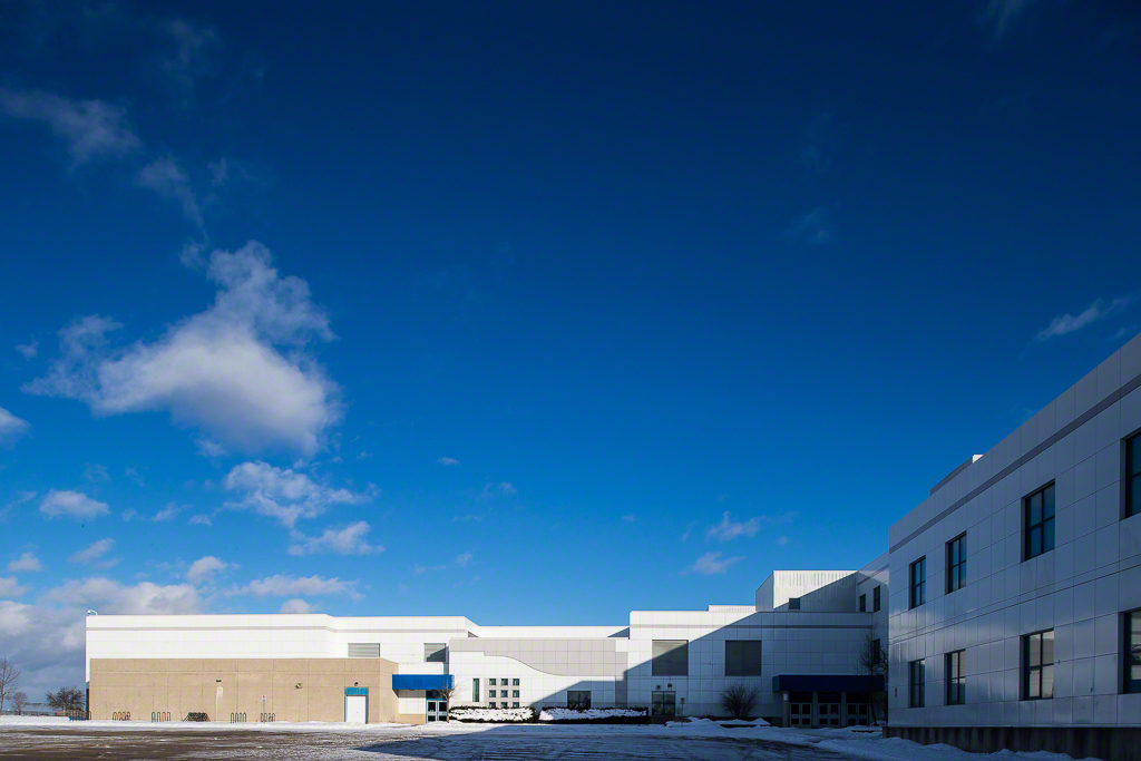
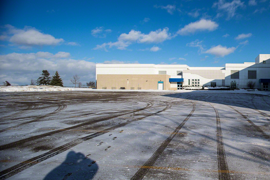
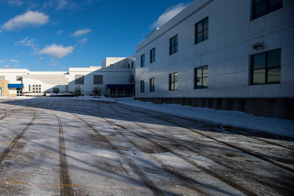
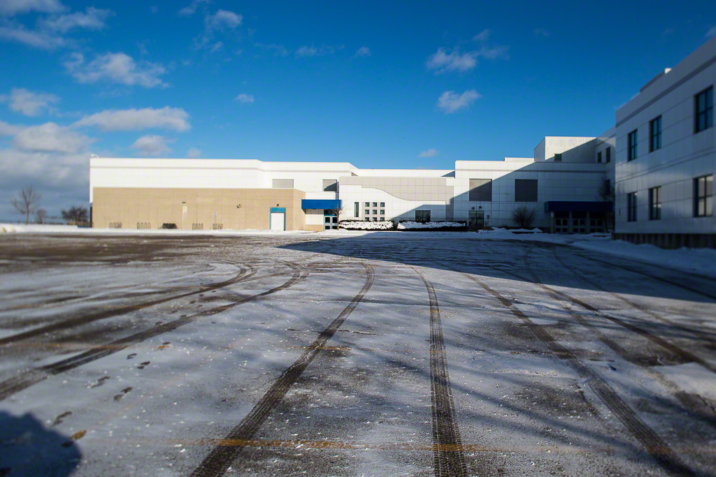
Hello everyone!  This time I want to tackle a subject that regularly comes up in classes and coursework.  It’s also a topic on the Internet with a variety of fascinating ideas. We often hear of lens compression and as Lee Morris recently demonstrated on Petapixel. it actually does not exist.  I don’t agree with some of his terminology, but the approach is bang on.

Read More

Focal Length and Angle of View

Focal Length and Angle of View

I meet lots of newer creatives, whether shooting stills or video and they are rarely concerned about the physical focal length of a lens, which is particularly irrelevant as an indicator when crop sensor cameras get involved as they always reference lenses as if they are full frame even when not.  What real creatives are concerned about is the image and what goes in it and what does not.  This is partially managed by angle of view.

Read More

White Balance and Colour Temperature - They Aren't The Same Thing!

White Balance and Colour Temperature - They Aren't The Same Thing!

Over the last couple of weeks, I've run into a series of questions from folks pertaining to white balance and colour temperature.  There is some confusion apparently around equating the two and I think that this is worth a conversation.

Read More

Adobe and Tethering in Lightroom - Where is this going?

Adobe and Tethering in Lightroom - Where is this going?

I warn folks up front that this is not a how-to, or solution oriented post on making tethering work in Lightroom.  That has been covered in many classes by Scott Kelby and others, including myself.  Mostly it involves prayer, a blood sacrifice of some creature at least chicken sized, speaking in tongues and gnashing of teeth.  Then it works until it doesn't.

Read More

Understanding File Sizes

Understanding File Sizes

Why Are File Sizes Different From Camera to Camera and from JPEG to RAW?  Let's start with a couple of example cameras for which I have either owned or done quick looks.

  • Canon 5D Mark II delivers 21.1 megapixels on a full frame sensor
  • Canon 5D Mark IV delivers 30.4 megapixels on a full frame sensor
Read More

Medium Format Mirrorless for Street Photography

Medium Format Mirrorless for Street Photography

There's a school of thought for street photography that basically says "hide and be sneaky".  I understand the root of this attitude, the idea being that you will get more authentic images and perhaps more of an emotional charge from sneaking shots of people.

I hate this.  The world has changed in the time since I started photography.  Where in the past, you could walk around with a camera making images and no one cared, today people are much more concerned about being observed and their actions tracked.  That worrying about a single person with a camera when you are tracked by innumerable surveillance cameras that you don't see is, to be blunt, a bit wacky, seems immaterial.  People are rightly concerned about privacy and about how their image may be used.  You may have heard of this thing called the Internet.  Truth and it are not necessarily entwined.

Read More

The Photo Video Guy Guide to Exposing to the Right - ETTR

The Photo Video Guy Guide to Exposing to the Right - ETTR

Exposing to the right is a process to maximize the data that is captured in your images.  It is a workflow process best suited to shooting in RAW with the understanding that some post processing will be required.  It also gives you more latitude than your default exposure will deliver in most all cases.

Read More

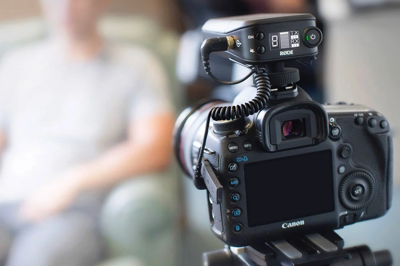
REVIEW : RØDELink Filmmaker Kit

REVIEW : RØDELink Filmmaker Kit

The demand for fast, high quality video increases every week.  Youtube and Vimeo libraries continue to grow as more and more people and companies use mirrorless and DSLR cameras to create video content for friends, communities and customers.  We also know that the thing that destroys good video fastest is bad audio.

Read More

Get a Head Start When It Comes to Shooting Portraits

Get a Head Start When It Comes to Shooting Portraits

For many photographers, shooting people is where it's at, or at least where we'd like to be.  Even if we prefer nature, or landscapes or wildlife, we all need to be able to make great portraits of people, even if only our friends and family.  After all, we do have a really good camera, right?

Read More

Studying EXIF IS NOT Helping You

Studying EXIF IS NOT Helping You

I've been a photography educator for a long time and a photographer for much longer.  On a saddeningly regular basis, I meet folks working hard to improve their photography trapped in what I call the Well of EXIF.  There are schools of thought that say studying other people's EXIF can help you make better images.  I violently disagree.

Read More

Real World Test : Canon 7D Mark II in crappy arena light

For this story to make sense, I must be clear on something.  I bought the 7D Mark II for two specific use cases, both tending towards longer lenses and both tending towards a preponderance of crappy light.  So you understand, the use cases for the camera are wildlife and sports.  Last night, I along with my good friend Will du Plessis, trundled off to the Aurora Community Centre to photography an OJHL match between the Aurora Tigers and Lindsay Muskies.  We both were shooting the 7D Mark II with the Canon 70-200/2.8L IS II.  To learn how the 7D runs at higher ISOs in horrible lighting, read on...Don't get me wrong.  I love shooting OJHL hockey.  The players really want to be there, work hard and are hoping to get picked for the minors or to head off to University on a hockey scholarship.  The arenas however, leave a lot to be desired from the lighting perspective.  This isn't the Air Canada Centre, the Aurora Community Centre is lit by banks of T8 fluorescent tubes which while white are not particularly bright. I never liked shooting my original 7D beyond 1600 ISO.  After that the noise became annoying and the contrast really started to flatten out.  When I did the test shots with the 7D Mark II, I found that it started to fall off badly after ISO 6400, so I went with the intent to shoot the whole game at ISO 3200.

The camera was set to aperture priority with the lens cranked wide open to f:/2.8.  ISO was set to 3200 and exposure compensation was +1 ⅓ stops.  I hope that this would give me decent enough shutter speeds to freeze action without turning every image into a grainy sack of mush.

Let me say up front that I am not yet acclimated to the 7D Mark II.  Enough has changed to put me behind the curve on it.  Some things are similar to other cameras such as the Case options for AF similar to those in the 1Dx.  When I shoot the 1Dx, I use Case 4 AF and did the same on the 7D Mk II.

My go to kit for hockey up to now has been the 1D Mk IV with a Sigma 120-300/2.8 stabilized lens at ISO 2500.  The Mark IV does a great job and the 1.3 crop gives me up to 390mm effective focal length, that I rarely use.  The 7D Mk II, has a 1.6 crop factor so with the 70-200 that should have ended up about 320mm.  First learning. For a recreational hockey arena where I want tight shots and not to have to crop away dead space more than 30%, 320mm is too short.  So next time out, the Sigma 120-300 is back on point.

The AF in the 7D Mark II is very fast.  It is not fast like the 1Dx but comparable in AF performance to the 1D Mark IV and that's very good indeed.  I was a bit off my game having not shot hockey in a while so I felt out of sync a bit and it showed in the images.  Shots were clean in the viewfinder and accurate on the LCD.

I shot in RAW (as I always do) and using a Sandisk 32GB Extreme card rated at 120 MB/s I never managed to fill the buffer.  I did find that high speed burst at 10fps was overkill and low speed at 3fps was inadequate.  Fortunately the 7D Mark II allows you to set your low speed burst rate.

I tried the anti-flicker setting on the camera.  I honestly cannot tell if it made a difference at all so next time I shoot without it.  I've also programmed the camera for back button focus only because I found that having focus on the shutter button resulted in extra frames because the trigger is a bit light compared to either of the 1D models that I have.

I set the camera to AWB and that worked out pretty darn well and left the Auto Lighting Optimizer turned off.  Never have found a real use for that since I tend to expose to the right most of the time.    Since I shoot RAW I don't worry about the colour space or picture style crap but I do set AdobeRGB and Neutral if only to get the LCD JPEG to look as much like the RAW as possible.

About 700 frames knocked two batteries in the grip down to about 75% so decent enough performance.  Shots on the LCD looked fine but Canon has changed the Info display and it no longer tells me the information I want to see the way I want to see it.  Instead they have replaced it with a scrolled display that shows all the JPEG setting cruft instead of the basic exposure info with a full sized image.  Those Canon folks build a nice camera, but they still do not understand User Interface.

The game was heavily dominated by the Aurora Tigers until the third period so I did not get the variety of images I would have preferred but that happens sometimes.

I pulled the CF card and put it into my card reader to import the images to Lightroom and to my horror, every image looked like it was on an acid trip to LSD World.  Arrrggghhh!  So I tried Photo Mechanic.  Arrrrgggghhh!  Then I decided to stick a fork in my eye and try to get the current Digital Photo Professional from Canon's site since Mac's don't come with DVD drives.  No problem so long as I manually TYPE IN THE THE FRICKING SERIAL NUMBER FOR EVERY DOWNLOAD!  Canon I have two words for you numbnutz and the first word rhymes with truck.  No one would actually steal your crappy software, so pull hard and reverse the cranio-rectal inversion you are suffering from.  Jerks.

Well that didn't work either.  But I knew that the 7D Mark II could save in RAW and to both cards and it worked, so I pulled the card from the Lexar USB 3 Card Reader on Mac Pro the cylinder and went down to the studio to try it in the Lexar Firewire Card Reader on Mac Pro the cheese grater.  Every image is just fine.  Hmmm

Is it the Lexar USB 3 reader?  Is it something in the new Mac Pro?  Is it some ghost in the machine?  I went back upstairs and put the SD card in the reader.  It has some RAW images on it.  They imported fine.  Hmmm I plugged the CF card into the reader again and checked again.  Everything is perfect.  Two hours lost in failed imports and assorted futzing about but it all worked the second time.  I still don't know why but have made a note to myself that unless I am in a rush, to use the cheese grater and push the RAW files right to the NAS and import them from there, rather than off the card reader.  Maybe the card is too fast for the reader on LR import.  Still don't know.

Anyhoo.  Lightroom does actually have a RAW converter for the 7D Mark II.  I am not certain that it is a GOOD RAW converter yet.  As yet, DXO does not have a RAW converter for the 7D, it's due in December.  I have found on other occasions that the DXO RAW converter does a better job than the Adobe one.  I did try Apple's RAW Converter with Aperture and I think it did a better job.  RAW conversion is a big deal to me, and even after post processing, I found the Lightroom files kind of flat, whereas the Aperture versions were better and with a lot less work.

So what about the noise?  Well when I did the studio test using studio heads in big light shapers, the 7D Mark II was excellent to 6400 ISO.  I was less impressed with it in crappy lighting in the arena.  For higher ISOs to look good, you need good light with decent contrast and I just wasn't getting that in the arena.  Noise at 3200 for hockey is about the same as the noise at 6400 with studio lighting.  Still a long way better than the original 7D, but not as good as I hoped it would be.

In fairness, I need to give it another shot.  I may take a trip to the Ray Twinney Centre to shoot a Hurricanes game.  The Hurricanes are my hometown team but the current owners are challenging and I gave up shooting the team about a year ago because for every nag with the Canes, the Tigers arena and people are welcoming.  Sadly the Twinney Centre has better lighting.  I will also turn that flicker thing off and try shooting with the longer glass to eliminate the need for so much dead space cropping.  I was hopeful to avoid the weight of the 120-300/2.8 and it's required monopod but I will give it a shot regardless.

I've attached a few images from the culled stack, none are awesome but they will give you a sense of what you can expect.  All images were processed in Lightroom for a minor exposure bump of +⅓, lifting of the shadows a bit, increased clarity, pushing the black point left and lifting the white point marginally.  Clarity and a bit of vibrance were added.  The image then round-tripped through Nik Sharpener Pro 3 and Nik Dfine 2 noise reduction.

Thanks for reading and until next time, peace.

Ross

Opening Up Your Eye

I often hear from photographers, who are typically strong individualists, that they are stuck, or have hit a wall.  Yesterday I led my third #Scott Kelby Worldwide Photowalk in my town.  Based on feedback it was a great success for the mid sized group of folks who came out. One of the most telling things I saw was the breadth and scope of images that were being made by the walkers.  Many commented that they made shots that they would not normally have considered doing, but by simply being out with other photographers, they were encouraged to get out of a comfort zone, to try something new, and to shoot subjects that they would not normally consider.

Yes I did plan the walk and knew where we would go and had some information to share, but I really think that it was the people getting out to shoot together that made the day successful.  Certainly we had great weather, and we had the surprise opportunity to shoot the fire truck helmed by Anne of the McCaffrey Street Fire Station, but everyone who came out really played off each other.

So if you think you are getting stuck, gather a few folks from your local camera club, or photographer friends and just go somewhere to shoot. It may amaze you what you see and discover, and the doors that this kind of thing can open up.

I am very grateful to the hard work done by the folks at KelbyOne to make the worldwide walk happen, and I really feel for them as the registration system let them down in the last few days.  They do great work, but you don't need a global initiative to go do a walk, just go, but go with other photographers to see the possible.

The Scintilla of Difference

divine_fire_spark.jpg

I was recently watching a session with one of my personal favourite instructors and photographers, Mr. Joe McNally, and he used this phrase in part of his discourse.  He described it as the difference that sets your work apart from all the other folks doing something very similar.   As he often does, a word from Joe prompts me to think deeply about a concept.  Want to learn all about this? Scintilla means a tiny trace, or spark, of a specified quality or feeling. What sets a great photograph apart from a good photograph is the scintilla of difference.

Think of this.  How many sunset photos have you seen?  How many have you shot yourself?  After being involved in photography for over 35 years, I've made more than enough images myself and when I worked a long time ago in photographic retail when film processing was a big deal, I saw literally thousands of sunsets.  To the person who made them, each of them was wonderful and special.

The question to ask is, do they set themselves off differently from every other sunset?  We have all seen a sunset that was beautiful or majestic or had amazing colour.   We've probably made images of them.  They may still ring great bells for us, but most of the time that is because they act as a mnemonic trigger, releasing the memory of what was happening and how the shooter felt at the time the photo was made.  For those without the memory, it's a pretty picture.  Probably.  Or it might be the ten thousandth sunset picture that they have seen and they are now so jaded by sunsets they could care less if they ever see another sunset image.

This leads to the next major step in our own development as artists and as our own photo editor.  There is nothing wrong at all with liking one of your images.  There is nothing wrong with you printing an image of a sunset and hanging it in your home if it matters to you. The question is whether it belongs in your portfolio or your online archive of work.  If it's just another beautiful sunset, where its only power is your personal mnemonic trigger, then the answer is probably not.   We've talked a lot at the camera club and in my private classes about the importance of framework in the work you publish.  Does the image tell a story that a viewer can clearly understand?  Does the image provide a framework where the viewer can write his or her own interesting story?   At a recent club challenge, local photographer Bill Bell shared a street image he made in Paris.  It was extremely well received and not for the technical excellence.  What made the photo special was the framework created so the viewer could write his or her own story about the woman in the image.  About ten members offered their perspective and their stories were different each time.  If Bill knew the real story, he smartly kept it to himself, the viewer's own stories being much more poignant and relevant to them.

Great photos have this spark, this scintilla of difference that sets them apart.  I think of Alfred Eisenstadt's images of Marilyn Monroe in her back yard, Arnold Newman's portrait of Igor Stravinsky, Gregory Heisler's image of Muhammad Ali, John Paul Caponigro's work in Iceland or Moose Peterson's bear series.  There's a certain something that sets those images apart, something that the artist has seen and made available to the viewer, even when separated by decades as with much of Eisie's work (Alfred Eisenstadt's book Witness to our Time was my personal inspiration to take up photography).

Social media encourages people to publish everything.  When Google + first started up the Food Photography community, the work was fascinating and you could see that the publishers were trying to tell a story or show a set up or coach newer shooters on a process.   Now it is a near endless movie of out of focus, poorly exposed, badly composed photos of people's lunch.

One of my friends, Valerie, really enjoys flowers.  She grows them, she hunts them and she photographs them.   This is a very hard gig, and Valerie only does this to please herself.  Any photo editor will tell you that if you put an image of a flower in your portfolio it had better blow the doors off, because flowers are naturally beautiful.  Your image has to do more than just replicate the beauty.   Yet every day there are thousands of pictures of very beautiful flowers published on social media.  They are beautiful.  And they look like every other one with very rare exception.  When Valerie puts her artist into a flower image, there's more there than a beautiful flower, and for the image to have any weight at all, there has to be.

As a student, a teacher, a mentee and a mentor, I search for the scintilla of difference.  I've missed great images because I was too busy focusing on getting a great image.  I've made hundreds of images while doing an assignment and come back with nothing.  When mentees ask how many keepers I have at the end of a day, I tell them that I have had a very good day if I retain 6%.  I have worked very hard to be a very tough editor of my own work.  I don't publish often and I am very lucky that when I do, I receive the kind of critiques I need to get better.  Coming full circle, the best instructor I have ever seen give critique is Joe McNally.  He is clear, he is direct but he is never demeaning or arrogant.  I like to believe that I have developed my own critique style based on what I have learned from Joe and also what not to do by watching other critiques, the providers going unnamed so as not to be rude.

So that's the challenge gentle readers.  Before you publish, heck before you even start post processing, does the image have the scintilla of difference that will set it apart, does it have the spark, that raises it above the fog?

Later

PS, could we all agree to remove the phrase "awesome capture" completely from our vocabulary as it is both meaningless and trite.

Removing the Creative Blockage

We've all been there as artists and creatives.  The place where nothing seems to work, where we feel stalled, stuck and perhaps even contemplating moving on to another interest.  I've been there as a photographer, a musician, as an archer, and am there now as a videographer.  It's not the end but it is cusp or inflection point, so I thought I would share how you can get past this point and grow again.Sometimes the easiest answer is to stop and take a break.  I did that a long time ago as a photographer.  I took a break, albeit too long a break.  The photographer I am today is a much better photographer than when I took the long break because in that time, I learned a lot, and apparently I am a slow learner. That Won't Work

I hear very often this very statement from folks I am mentoring, or students in a class or other people out on a shoot.  I offer the following guarantee.  If you say this, even mentally, you're right.  Don't even bother trying, you've already decided.  Sound foolish?  It is.  Stephen J. Covey made lots of people rebuild their thought patterns by encouraging them to start with the end in mind.  There is a ZEN principle, that says to envision the end before the start.  If your envisioned end doesn't work, you'll get there.

I Will Probably Fail

I surely hope so.  We are not expert at anything the first time we do it.  Or perhaps not even the thousandth time we do it.  While focused repetition can be the mother of skill, failing to fail is a guarantee of not learning anything.  To quote Alfred Pennyworth, "Why do we fall?  So we can learn to get back up."

I Don't Know How

At one time this is true for everything we do.  If you have learned to walk, at one time you could not.  If you read, at one time you did not.  If you speak a language at one time you could not.  None of these skills burst fully formed into existence.  We learned.  It took time.  We practiced.  We got better.  How is this different from art?  Does the great pianist play Rachmaninoff on the first day?  Was Adams' first image of Half Dome also his last image?   Focused repetition is the mother of skill and the availability of the knowledge to do new things is more available today than it has ever been.  That knowledge is not an end in itself, it is a tool to help you extend your creativity.

It Might Not Turn Out

Oh paean to negativity...  This very statement says that it might actually turn out.  So do it.  With a bit of positive orientation, it might just turn out, and if it doesn't you could be a step closer to when it does.  When I get an idea or concept in mind, I don't get there in one image capture.  It can take lots.  Sometimes so many I wonder why I keep trying.  But I get there often enough to keep going.  I don't play golf, but I am told by those who do that the one great shot makes up for the hundreds of truly horrible ones.

What If No One Likes It?

And to this I say, who the heck cares?   Van Gogh wasn't painting for someone else's pleasure, he painted because he had to, for himself.  By the way, he was not well appreciated in his lifetime, but now, hoo boy, major artist that fellow.  I know that it sounds anti-social but if you are making art with the primary goal of pleasing anyone other than yourself, you've started with the wrong end in mind.

I Don't Have Anything to Post Today

Good for you.  Be honest.  If you look at the tidal wave of images on social media. how many really capture you?  How many times do you plus or thumbs up something, purely because some one did that for you or you think you have some kind of social obligation to do so.  "Liking" stuff that you really don't like is destructive to your creativity.  It lowers the bar for acceptability and inhibits your ability to strive.  Don't get me wrong, I see some really compelling pieces of art when I bother to look at social media.  But those are the gems in an ocean of dreck that does nothing for me other than make my eyes hurt.  If you aren't posting every day, that doesn't make you a bad artist, it makes you honest and selective and by the way scarcity makes work more in demand than abundance.

I Cannot Think of Anything to Shoot

Right again.   Try this.  Stop thinking so hard about what to go shoot and just go shoot.  See with your mind open and something will reveal itself.  When I ride the motorcycle, I rarely take a camera because if I did, and if I stopped every time I saw something I would never get anywhere.  I make mental notes of what was revealed and will go back with time or seek out a similar reveal.  I need to stop more in the moment and count on seeing it again less.  It may not be there again.

My Work Will Not Be Well Received

If by this you mean that someone won't like your work, you're right and if you let this stop you, well you've made an intellectual decision to stop and let the voice of another change your existence.  It's a fact of life that for every piece of art, there is someone who hates it and that someone is probably the classless type of bottom feeder that he or she feels that others want to hear what he or she has to say.   A critique can be very useful.  A critic is good for organ donation.  And by the way, just because someone offers you a critique, sanctioned or not, the virtue of its existence does not make it valid, unless you decide it to be so.

Making Art Seems So Selfish and Everyone Knows Selfishness is Bad

I'm not sure who "everyone" is but they need to be drowned and soon.  No person can add value to anything before that person values and cares about himself or herself.  If you place no worth on yourself, you cannot place worth on anything else.  That's a parasite. Art is by definition selfish.  You make it yourself.  No one else makes your art.

Trust Yourself and Go Do

Not to be all Yoda-like but there really is no try, there is do or do not. The greatest barrier to creativity often lives between our own ears.  We create our own walls, often more formidable than those that others might try to erect in front of us.  For most readers, photography exists in a space covering hobby to passion to source of income.   There are always those who will criticize, not as help but as a way to exert power you grant them over you.  There's a two word phrase for those folks, and you are all smart enough to figure it out for yourself.

So go do.  You will love some of the work you do.  You will hate some of it.  You  will be thrilled.  You will be saddened.  Welcome to the human race.  Others may have more skills in some areas but they won't have your eye, so go make your own work seen with your own eye.  Do new things, do old things, do different things, do the same thing, just go do.   If that sounds like a simple answer, it is.  There really isn't more to it than that.   The best way to breach creative barriers is to recognize that they are of our own creation, and then to tear them down by determining that they add no value.

See the finished work, make the image, edit the image and do what you will with it.  Publish it, print it, hide it away forever, it's all your choice.  Make the choice to create.

A Great Car, A Great Couple

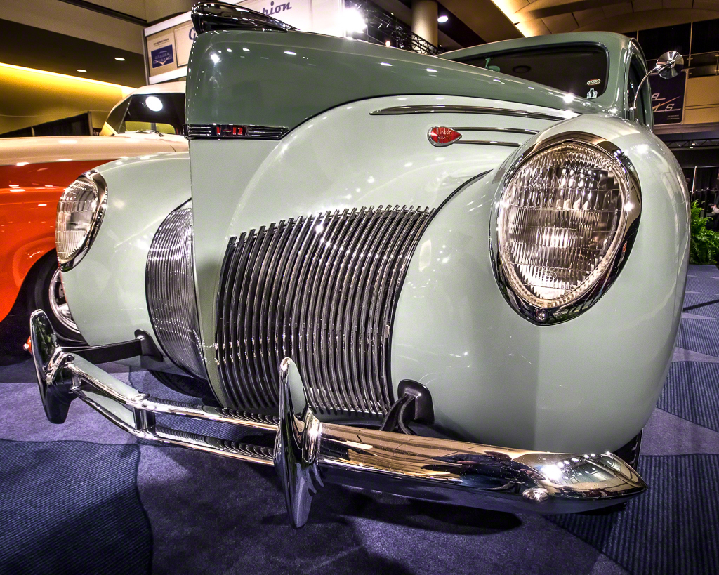
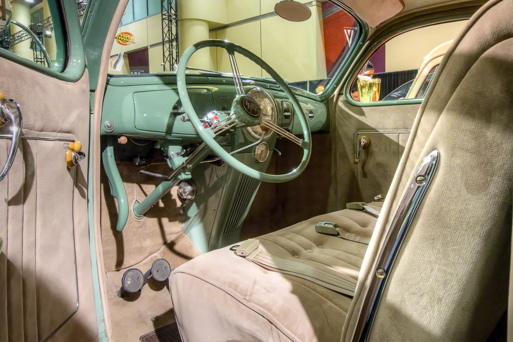
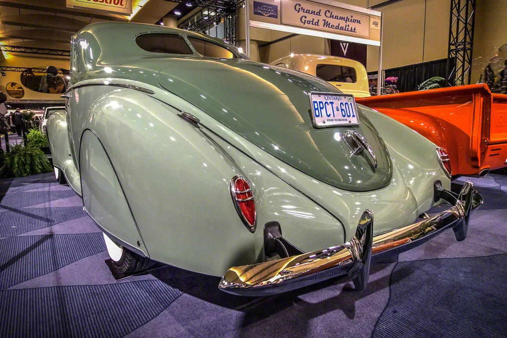
Last night, #Bryan Weiss and I ventured into the throngs at the Canadian Auto Show at Toronto's Metro Convention Centre.  Lots of nice cars of course, but this post is about a couple and the car that they showed.  It's a stunningly beautiful 1939 Lincoln Zephyr.Bryan and I were doing what we usually do, quietly and respectfully making images of cars that appealed to us.  As in past years, we seem to enjoy the exotics and the classics most of all and on entering the Cruise Nationals area, I came upon this wonderful Lincoln Zephyr, restored by Mr. Dave Jolly. I had made a number of images and had been bracketing exposures because this was my first time shooting Olympus' OM-D E-M1 as part of a forthcoming review.  The thought had occurred to me to also do some HDR because let's face it, the lighting at Auto Shows is usually horrible, very contrasty, with harsh shadows and because I recently purchased V5 of Photomatix Pro.  Photomatix has not been my favourite HDR tool.  I tend more to Nik's HDR Efex Pro 2 or the 32 bit HDR option in Photoshop.  Some initial tests with some shots from Camp 30 impressed me greatly.  Be sure that Photomatix is still capable of that overblown, over saturated, over ghosted, overdone HDR it is so well-known for.  Fortunately, there are other and better options, including a much improved 32 bit implementation.  But that's for a different article.

For the course of our evening, dealers, and owners as well as the cleaning professionals had been incredibly gracious, letting us set our small carbon fibre tripods inside the ropes and walls to obtain unobscured shots.  I thank everyone who made my image making more successful, and specifically thank Dave Jolly as you'll see and the very nice fellow from Grand Touring Automobiles who allowed me to get an unobstructed shot of the interior of the beautiful Silver Wraith.  Bryan did meet one grumpy sort and neither of us will post photos of his metal flake pickup that does not evoke the wonderful history of the real truck.

Which brings me back to the wonderful Mr. Dave Jolly and his lovely wife.  Mr. Jolly opened up his Lincoln so I could grab a shot of the lovingly restored interior.  He didn't have to do that.  I was actually moving on when he offered.  Mr. Jolly and his wife also spent time with me telling the story of the restoration, correcting my own misunderstandings and errors of knowledge and were just wonderful folks.  I mentioned that I was sorry to see that the Zephyr had not won first prize as it absolutely turns on the Wayback machine.  The paint is as close to what was available in 1939 that Mr. Jolly could discover.  The duotone is not what would have come from the factory, but does nothing to prevent you from taking a trip back in time.  This is a pre-war, post-depression vehicle, of a time when Lincolns were scarcer and very high end.  It has great character with its warship prow and immensely long and elegant tail.

Mr. Jolly has done a beautiful job.  You cannot see in the photos the six inches of steel all around the coachwork bottom that Mr. Jolly had to create and bend to replace the corroded original body.  It would be tempting when doing a car like this to go for a brighter colour, perhaps with out of time metal-flake, but Mr. Jolly went with a colour that resonates and replicates the time when these cars ruled our roads.

I saw many cars that I really liked at the show, from current Ferraris, the aforementioned Wraith, the Aston Martin Vanquish, and my long dreamed for Charger R/T 440 Magnum in that electric purple long gone and never replicated.  That said, the car that inspired me most was the beautiful Lincoln Zephyr.

The images here are all HDRs done in Photomatix Pro V5 after basic editing in Lightroom.  The camera was the Olympus OM-D E-M1 with the Olympus 9-18mm wide zoom.  ISO was 1600 to allow for the low light.  Exposures were a bracket of 3 frames +- 1 EV.  I used a slightly modified Enhance 2 preset in Photomatix Pro for the external shots, and a more ethereal custom setting for the interior to enhance the sense of ghosts.  All shots were sharpened in Nik Sharpener Pro and then adjusted for noise in Nik Dfine.

Understanding Tilt + Shift Lenses

I recently put hands-on a used Canon Tilt + Shift lens and wanted to clear up the myriad misconceptions around what these lenses do.  I was distressed to see so much misinformation out there and hope that this helps readers get a clearer idea of why Tilt+Shift can be so powerful.

There is lots of babble about the tilt-shift "effect", usually in relation to using focus plane adjustment or making things look like a "toy".  This usually means taking a normal shot and making it look like it was shot with a macro lens with limited depth of field.  It's an eye trick, and while some people like it, it gets old very fast and severely under-utilizes the power of tilt + shift lenses.  You'll note that I refer to Tilt + Shift instead of Tilt-Shift.  I credit Australian photographer Peter Hill for educating me on the distinction and seeing as I find his argument so credible, elect to continue using his nomenclature.

Let's step back a bit.

With a view camera, there are two standards, the lens standard and the film plane standard.  On a view camera, both standards are adjustable in four ways.  Rise and fall means that the standard can move up or down without altering the angle of the lens or film plane.  Shift means that the standard can move left or right without altering the angle of the lens or film plane.  Tilt means that the standard can tilt forward and back without altering the vertical or horizontal position of the lens or film plane.  Swing means that the standard can swing to the left or right without altering the vertical or horizontal position of the lens or film plane.

With a DSLR style Tilt + Shift lens, instead of there being four movements available simultaneously, there are only two available simultaneously (mostly).  This isn't a bad thing at all, just a fact of life.  All movements in this type of lens are like moving the lens standard on the view camera.  The rear standard (film plane) is fixed.  Most TS lenses will offer rotation, so you can have either Shift or Rise/Fall but not both fully independently.  Because the rotation is free, you can get shift and rise/fall together but not with the exactitude of separate adjustments.

Similarly in standard orientations the lens can either tilt or swing but not both.  Again, using the rotation capability you can get some level of tilt and swing, but not with the exactitude of separate adjustments.

Please note that a full tilt with a full shift may cause vignetting to occur, although newer TS lenses have larger image circles to combat this.  For example, I was using the first edition of Canon's 24/3.5L TS lens.  The second edition, has an image circle 1.5x bigger so this reduces the likelihood of vignetting substantially.  When you look at the samples under Combinations, you can see vignetting happening.  Yes I could correct his in post, I simply chose not to do so, in order to illustrate the point.

Be aware that there is no autofocus in a Tilt + Shift lens.  This is logical since the focus plane is by definition, unfixed.  There is also no autoexposure.  With the lens centred, take your light meter reading and then make those settings in manual mode.  When you start moving the lens options, the meter reading will be wrong.  So learn where manual mode is and how to make a setting in it before moving the lens.  Using a handheld incident light meter will of course be helpful.

Also note that this lens is not one of those that you will use Lens Profile corrections for in your editing software.  That would defeat the purpose somewhat.

Let's take a look at the different movements

Rise / Fall and Shift

In these scenarios, the lens is raised or lowered, or shifted to the left or right, relative to the film plane.  It's kind of hard to describe so I made some simple (and boring) shots to help illustrate.  Rises and shifts tend not to introduce distortions and are very useful when photographing buildings to prevent them from appearing to be falling over or leaning.  These movements are also awesome for big landscapes where you cannot get into the exact position you want to be to shoot from but need more than you could get without tilting the camera.  All the images you see here are shot from EXACTLY the same position, camera on a tripod.  These are samples of rises, falls and shifts.
Tilts and Swings

In these scenarios, the lens is moved so it changes the focus plane that the lens delivers to the sensor.  So subjects in different parts of the viewfinder but at the same distance from the camera can have one in focus and the other out of focus.  This is the "toy" effect. Much more useful is if you are shooting a canyon where the far side varies significantly in distance and you want all elements in focus, but the lighting or other situations prevent you from going for maximum depth of field.  By swinging or tilting the lens, you change what is in focus and can align the new focus plane to the subject.  I've seen Moose Peterson use a tilt to pull more foreground into focus in a landscape to create the image of more depth.  There is also a capability to combine tilts / swings with focus stacking to get incredible depth of field while correcting for distortions such as mountains leaning over backward or buildings appearing to lean in towards the centre.  Here are some samples showing tilts and swings.

There are new corrections in Lightroom and Photoshop and also in dedicated applications such as DxO Viewpoint to help correct for falling and leaning that frankly costs a lot less than a TS lens, so judge accordingly as to the value that owning a TS lens would bring you.  Rent one a few times before dropping major coin on one.

Combinations

You can of course mix Tilts and Shifts in a single image.  This perhaps where a TS lens becomes most agile, and also the most work.  Here are some samples with multiple movements.

In closing, Tilt + Shift lenses are not for everyone, but may be for more people than would initially be considered.  And let me be clear.  Lens Baby style kit ARE NOT like a Tilt + Shift lens.  They are capable of altering the tilt/swing of the lens but do not shift and their mediocre optics become tiresome in short order.  With great respect, they are more toy than practical tool.

A Tilt + Shift lens could be an amazing tool in your photographic arsenal.  The sample images really don't do the power of the lens full justice but they do give you a sense of the capability.  To reiterate; every frame was taken at the same exposure, same focus from exactly the same position on a tripod.  Camera was a Canon 1Dx with Canon's 24mm f/3.5L I Tilt + Shift lens.  Images were imported into Lightroom 5.3 and then exported to high quality JPEG for web presentation.  1/160 f/13 ISO 100 +- 0EV

Q & A : How do I make a High Key portrait?

To ask a question simply send an email to ross@thephotovideoguy.ca Reader Jens sent in the following question. "I have seen some portraits called high key on the web.  The picture looks very light and the background is completely washed out, but there is still lots of detail.  How do I do this?  I have a Nikon D7100, a 105mm micro and a SB-910 flash.  I think I need a background and more flashes but I am not sure.  Is this an expensive method? Can you help?"

Thanks for writing in Jens and yes I can help.  High key as a style has come in and out of favour over a long time.  I like the look myself and it's pretty easy to do.  You will need at least one, probably two, more flashes but you don't have to spend a ton of money on the other flashes since purely manual ones will do.

It will help if you have a flash meter but it isn't completely necessary.  I will tell you how to do it without a flash meter using all the flashes in manual mode for simplicity.  You will definitely need a white background, preferably a paper roll to reduce wrinkle shadows, a background stand of some kind and a diffuser of some sort for your SB-910.  Fortunately you have a D7100 that supports Nikon's Creative Lighting System so this gets easier to get your flash off camera.

Let's work back to front.

Start by putting your paper roll on the background stands and rolling it out to make a smooth backdrop right to the floor and forward on the floor a bit.  You want white on the ground for more reflection.

Put a simple manual flash head on either side of the background and angle them so the beams "cross" each other to make even light coverage on the white paper.  Set the flashes at full power to start and make sure that their slave mode is enabled.  This will cause them to fire when they detect your main flash going off.

Put a mark a few feet in front of the flashes where your model with stand or sit.

Put your SB-910 in manual mode at say ¼ power and put it on a stand and use a soft box.  If you are doing only head shots, a 20" x 20" soft box will do the job, go bigger for more coverage.  A good place to start is the Lastolite Ezybox Hotshoe.  I recommend the Joe McNally version for high key because the box is lined with white instead of silver, producing a softer light.  The box comes with the bracket for your flash, you will need a light stand and tilter bracket as well.  If you already have a flash diffusion system, you can get by with what you have.

Position the soft box so it is in front of the model and aiming down towards the model.  This produces a sort of beauty dish style light but one that is softer.

Set your D7100 to Commander mode so the popup unit will trip the SB-910 but not contribute to the light.  You might need to fiddle with the sensor orientation on the SB-910 to get it to read the popup.  If this is a hassle or you are shooting right under the soft box, you will need a set of radio triggers.  Get the Cactus V5 system and you are good to go.  They don't do TTL but you will be just fine without it, and it doesn't really work for high key anyways.

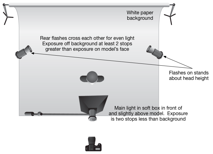
What you want is the light on the background to be AT LEAST two stops brighter than the light on your model.  So if your test exposure says that you get a very nice exposure of the model at 1/125 and f/5.6, you want the exposure on the background that gives completely white response to be at least 1/125 at f/11.  This is why you turn the back flashes up high and the front one down a bit, to help get this ratio happening.  You aren't using TTL because your camera would be trying to turn down the background making the model silhouette out.  This is where manual is best and actually easiest.

I've attached a simple diagram so you can see what I mean.  Keep your main light close to the subject so it's really soft.  You may need to dial down the power on the SB-910 to get the right ratio, just keep adjusting until you get the initial exposure on the face right and then manipulate the power on the two rear flashes so they are at least two stops brighter.  This will give you the washed out background, some nice spill around the model's periphery and that high key look.

Now start experimenting with some over exposure of the main exposure.  If the "correct" exposure is 1/125 at f/5.6, shoot at f/5, f/4.5 and f/4 to see which you like best.  You'll be overexposing the background as well but there's a lot of subjectivity that goes into what the "right" exposure from your main light is.

Lighting Diagram for a High Key Setup


Now, if you have a flash meter, it gets easier because you just meter the light coming off the background when the rear flashes fire and then set the output level on the main flash to be at least two stops less.  What does this get you?  It saves you time getting to your starting point.

Ideal Gear Scenario

  • 3 Flash Heads of similar output, manual mode, output power control, slave function
  • 2 Light Stands with hotshoe flash mounts
  • 1 Light Stand, Boom optional
  • 1 Softbox, flash bracket and tilter head
  • 1 Background Stand Kit
  • 1 Wide Roll White Background Paper
  • 1 Radio Trigger Set from Camera to Main Flash
  • 1 Flash Meter

Note that the gear listed is going to be useful for a lot more than just high key portraits and will be valuable for all kinds of different shooting scenarios.  I've recently discovered the Lastolite Hilite, a dedicated popup background specifically for high key.  It's a 6' x 7' pop up system with an outer white diffusion panel and an inner white reflector stitched together by separators about 16" wide.  It comes with four 16" rods to hold the front and back sections apart and has zippers on all four sides that open to allow you to get the front of the flash heads inside the enclosure.  It's not inexpensive but it is readily portable and collapses into a disk about three feet in diameter.  I've just ordered one in and will provide a review in the future.

Thanks for the question, I hope that this has been useful.

The Travelling Carnival

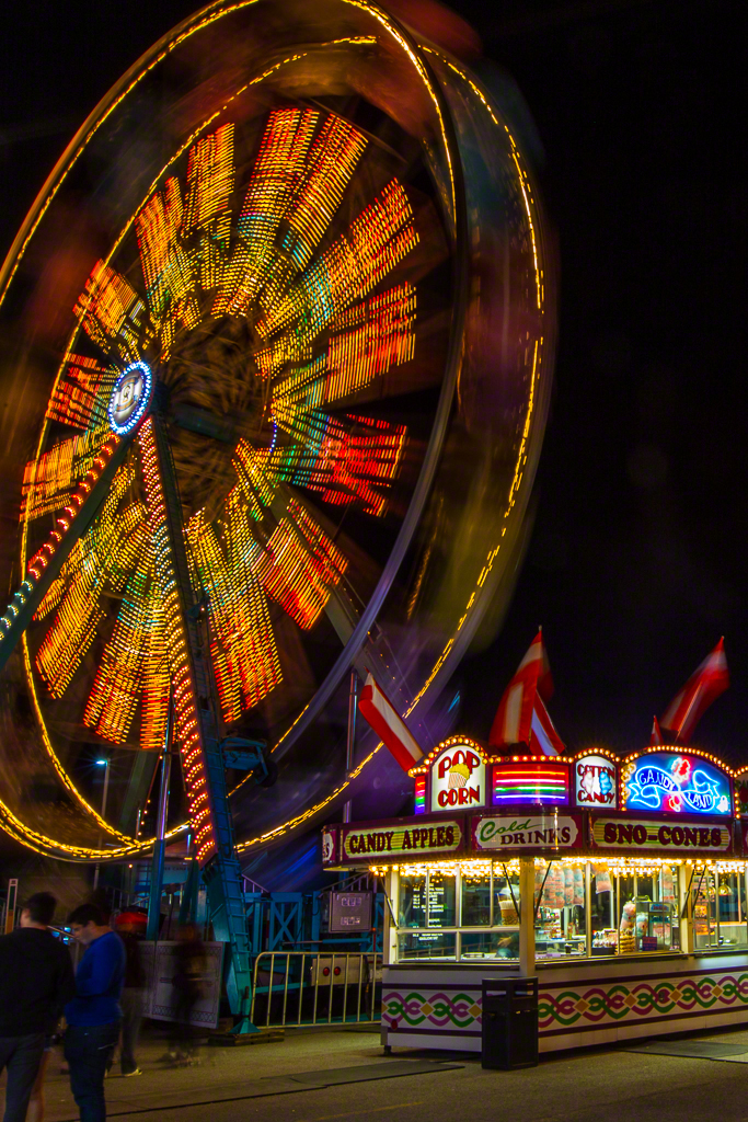
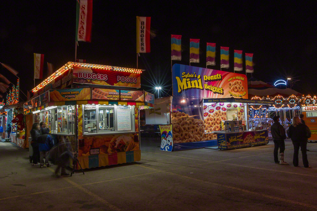
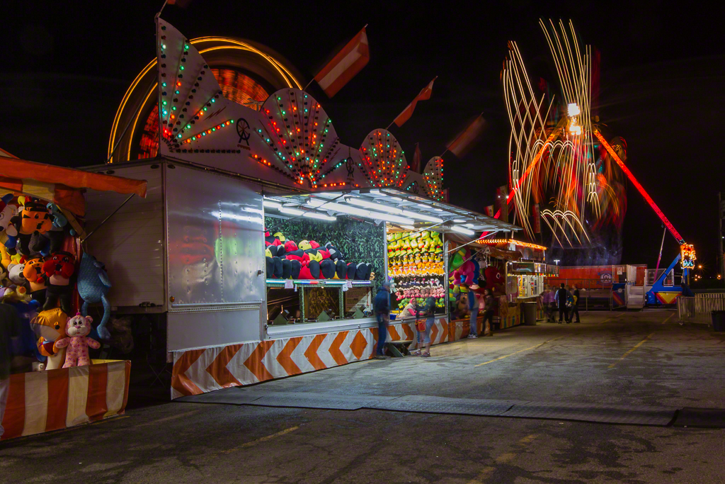
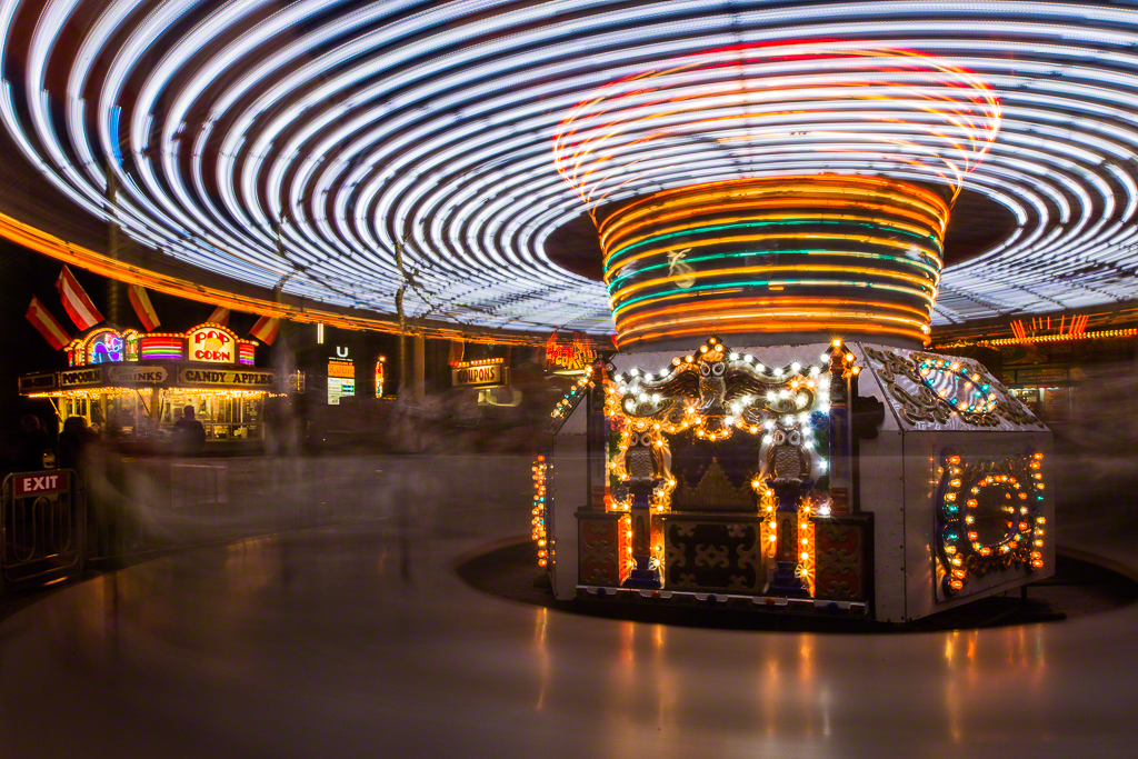
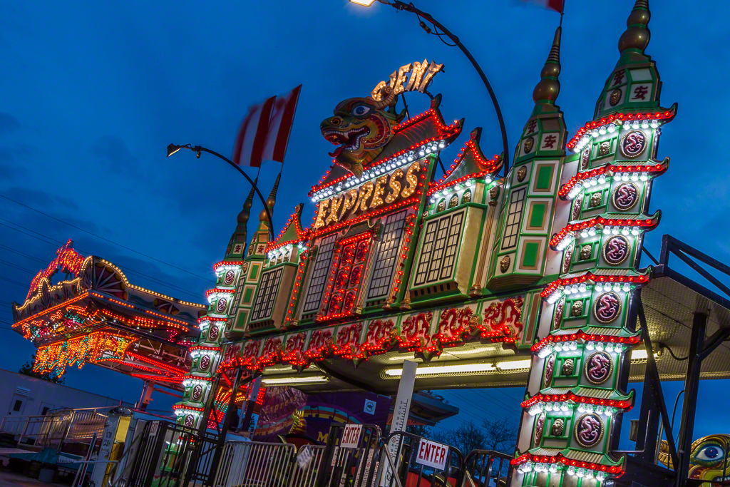
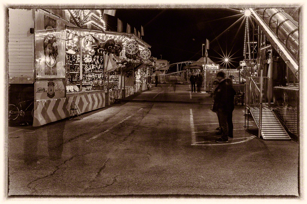
When I was growing up in small towns, the annual visit of the summer carnival was something to look forward to with excitement and fear.  They would bring rides and neat treats, and scary images and animals and in the more distant past "freaks".  Carnies are a very unique group of people and while things have tamed down a lot in nearly half a century, there's still a bit of magic and a lot of fun in the travelling carnival. This past weekend the show came to Newmarket, and while the weather was not good, given our endless winter, families and then later the teens came out to get out of the subdivisions and into a bit of fun and sparkle.  The carnies have been struggling, you can tell, but they were all very pleased to see us photographing them, the other patrons were pleasant and even tried to avoid "crossing in front of the camera" to prevent a picture from being ruined.  This was no issue since the primary goal was longer exposures and a ghosting quest.

I was lucky to have NCC member Isabel come with me, as a peer photographer, not a tag-along and she has self described and the fact that I have processed a couple of images as black and whites is due ENTIRELY to her inspiration.

The travelling carnival is a piece of the past that still exists in the face of always-on tech.  I suppose it's because I am of the generation of Rush's Lakeside Park, that I love going to photograph them and it was very cool to have Iz laughing beside me.  I do wish that the carnies were more commercially successful but it is what it is.

Since folks ask regularly about my workflow, it's pretty straightforward.

  1. Copy the images from the card to a hard drive
  2. Open them in Photo Mechanic and scan through the images employing judicious use of the  DELETE key
  3. Import the remainder into Lightroom
  4. Apply the lens profile correction to all imported images
  5. Process as desired
  6. Export as 1024 pixels on the long side at 72dpi as high quality JPEGs
  7. Open the exported JPEGs in Photoshop and apply the Digimarc digital watermark filter to all the images

In this editing session, I used Lightroom 4.4 for all the core editing as I wanted the images in my regular catalog, not the LR 5 test catalog.  The black and white conversions were done in Silver Efex Pro 2 (Ghosts in the Fair) and Perfect Black and White (Ageless).  They are very different plugins but through competitive offers you can have the entire OnOne Perfect Photo Suite and the entire Nik Collection (until the Goog kills it) for about $300, money well spent.

All my images were shot on a Canon 1D Mark IV using a Canon 16-35/2.8L lens mounted on a Really Right Stuff tripod and ball head.  I did try using a Hahnel remote but being powered it kept turning itself off so I just went with the 2s self timer in the camera.  All exposures were in manual mode using experience as a guide for the first frame and then moving around based on what I saw.

If you have one of these travelling carnivals come to your town, take advantage to go out and make images.  You'll have way more latitude than at one of the big theme parks, and the vibe is completely different.  Plus, you will definitely get some very cool images when you apply yourself.

Tips to Make Better Photos : Shooting Hockey

Shooting sports is not my forte.  I shot soccer and football a million years ago in High School and have been shooting Polo for a couple of seasons.  My friend Susan's son plays in the OJHL for the Aurora Tigers and I went out once last year to provide her some coaching support.  This year was busy but I've been pushing to make time to attend local games.  We're into the Quarter Finals of the OJHL playoffs and the action is great! 1Dx_NmktWhitby_-003020130303-156
What I love about OJHL hockey is that the young players are really committed to the game and are NEVER going through the motions.  I actually prefer this hockey to the NHL, but that's my choice.  I can attend a lot of games at a very fair admittance price, get very close to the ice and shoot like a mad fool without being in the way of the other spectators.  I have the good fortune of being able to attend local team's games as both the Newmarket Hurricanes' and the Aurora Tigers' home ice is reasonably close.
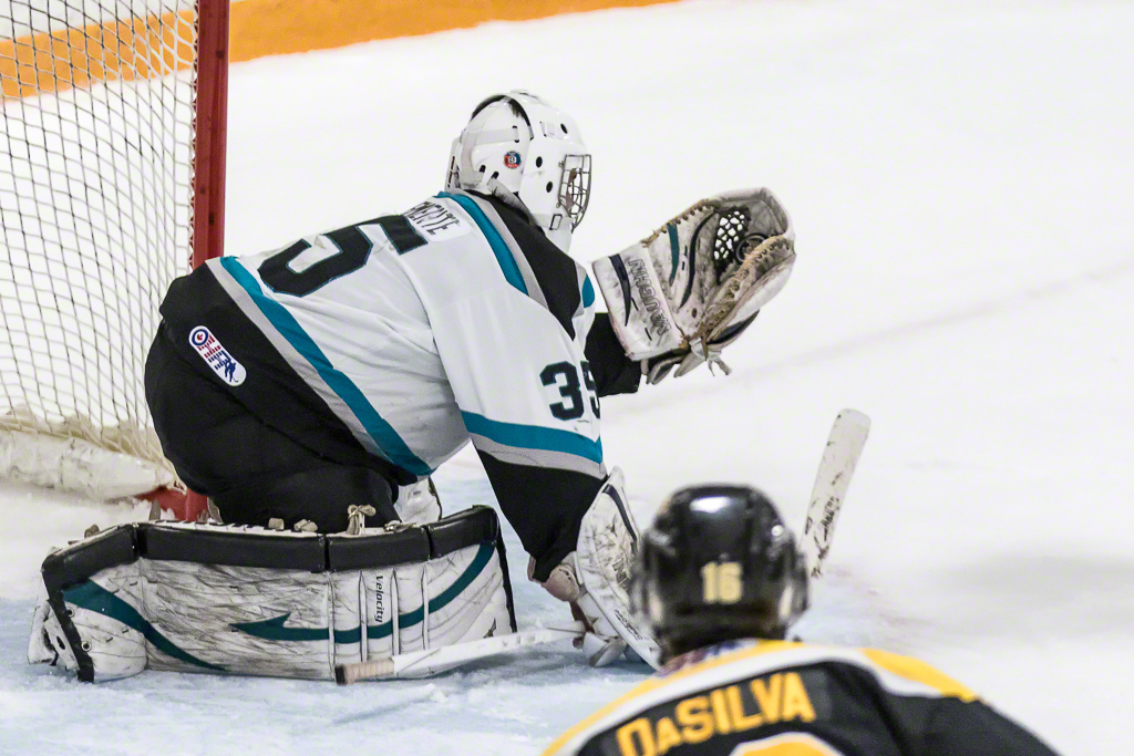
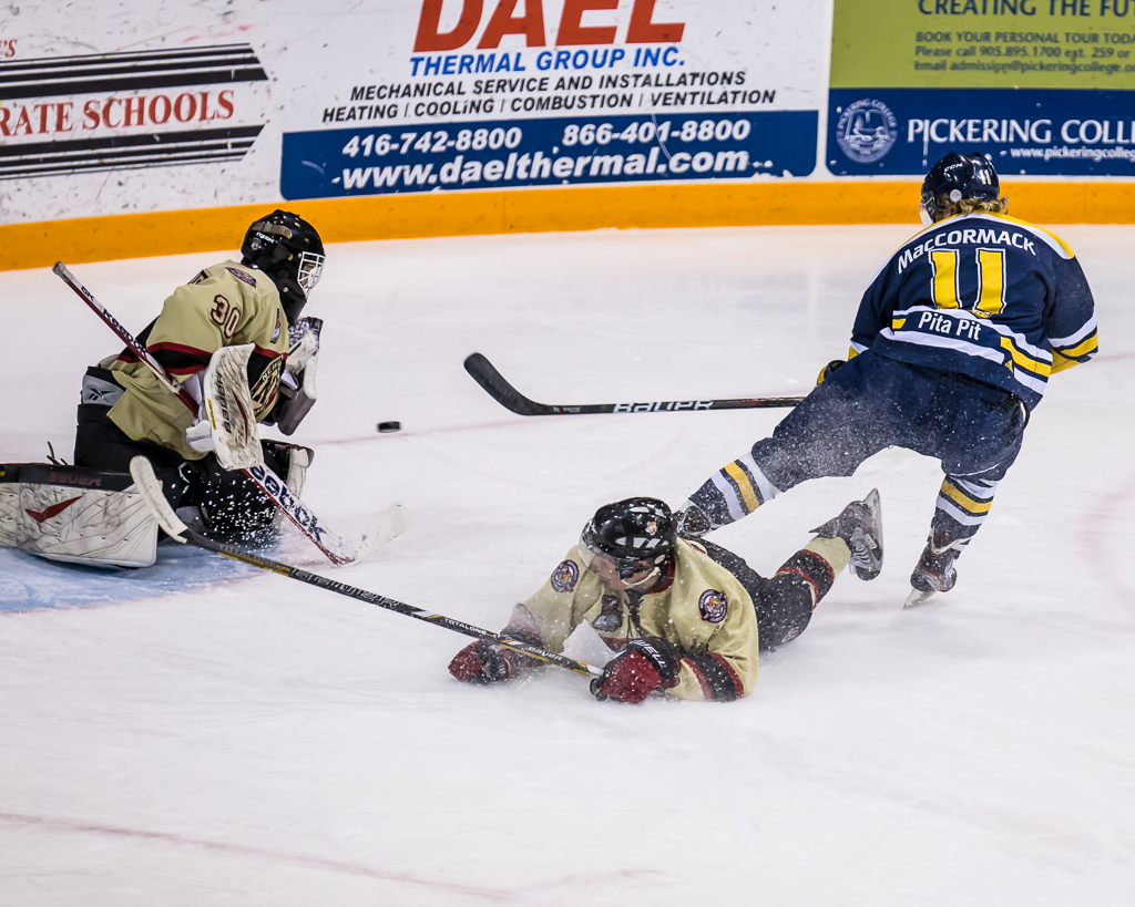
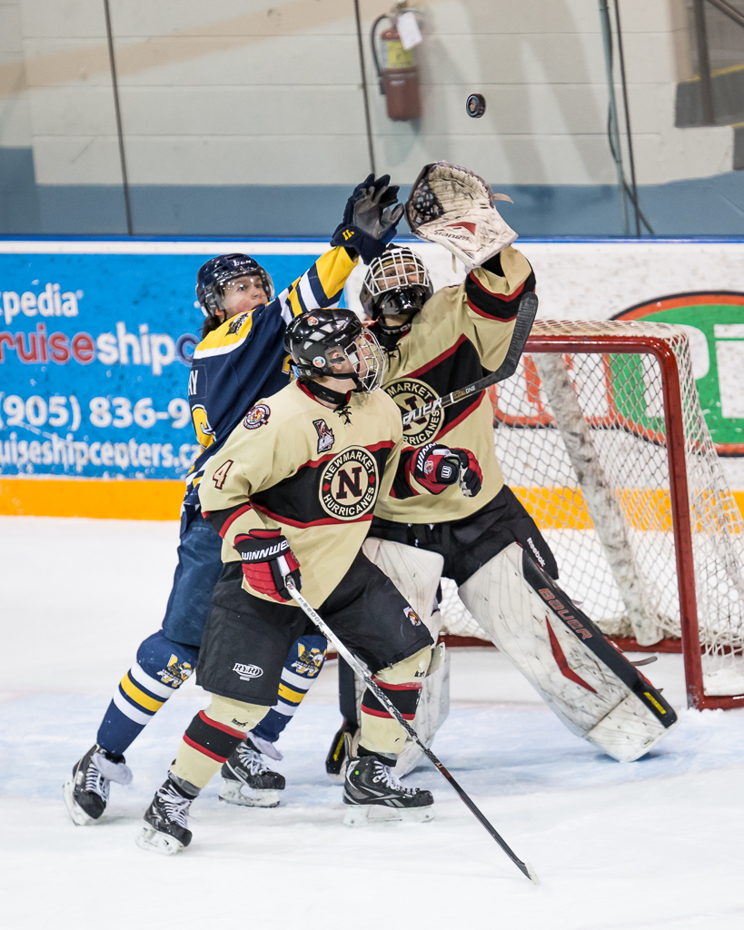
1Dx_NmktWhitby_-003020130303-354These shots are from a recent game between the Newmarket Hurricanes and the Whitby Fury.  I thought it might be interesting to share some of the things I have learned the hard way about shooting hockey.  First, you have to know the game, at least to some extent.  I surely don't know the ins and outs of hockey as well as my wife does, but well enough to set up for shots and to be continuously learning to anticipate where the puck will be, to paraphrase the Great One.

1Dx_NmktWhitby_-003020130303-73

So to get started, one of the first things I learned is that the lighting in Junior hockey arenas is pretty horrible.  It looks ok (mostly) to the eye but is a mess of colour temperature.  In the Ray Twinney Centre in Newmarket, my friend Brian Watts, who shoots hockey professionally, warned me of the "red" corners.  The ice looked fine to me live but once I downloaded the photos the span of white balance was all over the place.  I have tried arriving early to do a custom white balance but that didn't work out well because of the amount of variance so now I shoot AWB and correct in post.  The other thing about the lighting is that it is dimmer than you think it is.  I've shot everywhere between ISO 800 and ISO 2500 and now go in with the ISO set to 2500 and live with slighter reduced tonal range and nominal noise.  This is one place where the low light capability of the 1Dx blows me away.

1Dx_NmktWhitby_-003020130303-79My shooting kit for hockey is as follows;

  • Canon 1Dx in Av, ISO2500 EV, +1 2/3, Focus Tracking in Mode 6, AI Servo, Evaluative Metering
  • Sigma 120-300/2.8 lens either wide open or f/4 and RRS lens plate
  • Gitzo 3551 Carbon Fibre Monopod with RRS MH-02 Head
  • Black Rapid HD Sling Strap

That's pretty much it.  If I want "environmental" images, I put my Leica M9 with Zeiss 35/2 in my coat pocket.  As much as I love the Leica, rangefinders aren't optimal for sports and the high ISO performance need in hockey rinks isn't wonderful.

eos_1dx_03The 1Dx has Canon's new case based focus tracking module and I've tried all the different cases to shoot hockey.  The 5D Mark III has a similar system and I find that Case 6 for subjects that are fast moving and change direction erratically works well for shooting with the long glass.  I get a lot fewer missed shots because the AF is not transitioning in accordance with the game.  In this mode the AF works with me, not against me.  I can now say I understand why pro sports shooters love this camera.  In fairness most all semi-pro and pro level gear has focus tracking of some type built in, but I find the Canon system so fast and so easy to use, I love it.  I set a single focus point and follow the action, using the back focus button (AF-On) to enable the AF in advance so it's locked when I press the shutter.  Obviously I have the AF set to AI Servo mode.  I've tried spot, center weight and evaluative metering patterns and have gone back to evaluative.  It's not perfect but nothing in a hockey rink is neutral grey so my experiment with spot metering linked to the AF point produced a disproportionately high failure rate.

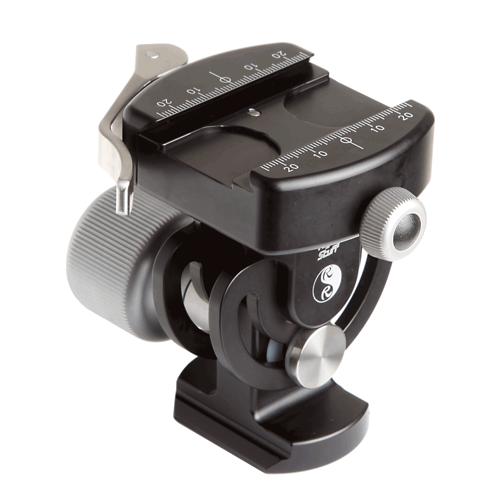
136_120-300mm_osThe Sigma lens is extremely sharp. There are Lightroom profiles for it and I give the Sigma folks credit for their design because the corrections are relatively small, the lens is that good out of the box.  The only downside to the Sigma is that it is big.  I mean really big.  I'm no tiny guy, but if I had to handhold this glass for a full period, I'd need a chiropractor, a sports masseuse and bed rest.  So I go with the Gitzo monopod and the Really Right Stuff MH-02 Monopod head.  This head is AWESOME.  It offers a smooth moving tile mechanism so I can loosen it off and have smooth but not sloppy tilting while panning with my body.  This is a new monopod head for me and I'm looking forward to the coming MH02LRPolo season as it will help a lot.  By mounting a Really Right Stuff plate on the lens foot, I can have the foot in the LR clamp on the monopod and leave the Black Rapid strap with the Really Right Stuff FAB adapter attached at the same time.  Very handy and very secure.


From a shooting perspective, I find arriving early at the arena and surveying potential shooting locations is critical.  Most town arenas have pretty beaten up glass and shooting through it isn't optimal.  You want to be close enough so you aren't cropping out 80% of the shot but also high enough so you aren't shooting partially through the glass.  I can shoot manual but find that Aperture preferred works well for me.  I set the lens at f/2.8 or f/4, depending on the available light and find in most arenas that with an ISO of 2500, I will get shutter speeds above 1/500 of a second.  Yes the lens has optical stabilization and yes I am using a monopod but that doesn't change the fact that hockey moves FAST.  In the sample pictures, I am able to mostly freeze the players yet in most cases, the puck is still blurred.  I like this as it conveys the sense of action.  You'll also note that by default I dial in +1 2/3 stops of exposure compensation to keep the whites from going grey.  I tried just dialing in +2 but I kept running into situations at certain points on the rink where the shot just blows right out.   I can add the 1/3 stop in post processing but if the important stuff gets blown out completely, there's no bringing it back.

Hockey is a blast to shoot.  I'm starting to wonder what sport I will shoot when the season is over other than Polo.  Junior hockey is a professional league and the OJHL is very supportive of photographers (no selling of images is the major rule).  Many other sports leagues are very protective of photographic rights or are against photography at all where youngsters are playing.  If your child is playing, it may be easier for you.

I'm hopeful that both my local teams go all the way.  They have a wonderful rivalry and it would mean plenty of games for me to shoot before season's end.  Many of the players I have photographed this year are going away to school on hockey scholarships next year, so we'll see a new group of players in the 2013-2014 season.  If you want to learn to shoot hockey, your local teams are a great place to go shoot and you'll be supporting your local community.

1Dx_NmktWhitby_-003020130303-272