Breaking the Rules
/I was asked by a client to write about this topic and thought that it would have even wider resonance because it can be such a great conversation. I have often heard that it’s important to break the rules of photography, but what is consistently left out is that to know when to break the rules, one has to first understand them. Doing otherwise, is very much putting the cart before the unicorn.
Why Are There Rules in the First Place
Let’s start by being open and honest and say that there are no rules. Photography is an art form, and while there are many guidelines for composition, exposure, timing and even for post-processing, there are no rules. The purpose of guidelines is to assist, not constrain the artist. So, the first rule to break, is to believe that you have to create art by someone else’s rules.
There’s No Such Thing As “Pure” Photography
We often read about the purity or more accurately, the lack of purity in photography. This is, on its best day, massive hyperbole. Whether film or digital the act of making an image is a change. While this may sound like a somewhat lengthy expansion of the Heisenberg Uncertainty Principle, it is a fact. An image not made has no impact, but an image made can have an impact and that changes things.
The Rules of Composition
There are many so-called rules, and rather than be pedantic and change their descriptions to be printed as guidelines, we will use the word Rules and agree that they are in fact only guides. The Rule of Thirds, The Golden Spiral, The Rule of Odds et. Al. are tools that the artists can choose to use in the creation of an image. The reality is that for the most part they are highly effective and if adopted can assist the artist in creating a more effective image. Where the misunderstanding or misinterpretation happens is when these guidelines become definitions of what is a good or bad image. This is a reason why so many photo contests and their judges are utter wastes of time and space. Guidelines do not make an image, an artist does. Use the guides as you will as an assistance to a more successful image, not as an outcome. If your goal does not reflect a guideline, then don’t use it. Do note that if you choose to share your image, some wiseacre who lives under the stairs in Mom’s basement will be sure to tell you that you broke the rules. Good for you.
The Rule of Thirds Grid
The most cited rule, the Rule of Thirds, is a very effective guideline. It leverages a psychological aspect of the human mind that divides a scene into triads. The guideline exists not because it is “right” but because it is a powerful coach into how human’s see. The intersections are known as the principal foci. Which one is most powerful varies by culture and is typically closely tied to how that particular culture’s language is written and read. It’s an incredibly useful tool, but if the tool gets in the way of your story, consider a different route. It’s ok to break a rule if you understand it and break it with intention and purpose.
What’s the Real Story?
All artists are storytellers. This does not mean that we are all great storytellers, or that every image that we make is a great story. It doesn’t work that way. Moreover, different viewers interpret stories or story frameworks differently. You as the artist get to choose whether you are telling a story for yourself or for someone else. Either is fine but accept that they may be mutually exclusive. You may choose to objectively and aggressively break an accepted “rule” in order to get your message across. This is not a flaw in your judgement, it is a choice in your creative process.
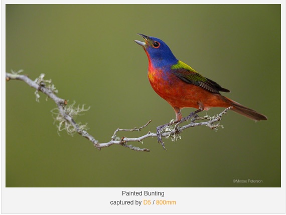
A popular opinion in bird photography is that the bird must always fill the frame and the more eyeball and the less everything else, the more successful the image. Yet, the respected wildlife photographer Moose Peterson, (and I admit a bias because Moose is my friend), regularly states that he is not an “eyeball photographer”. Moose certainly has the skill and the equipment to get the best eyeball shots out there, but he chooses instead to show the bird, or any of the critters he photographs, in the context of their environment. He emphasizes the story over the rule. He is very successful every day, breaking these rules.
Painted Bunting - Copyright Moose Peterson - used for illustrative purposes only
This example image by Moose Peterson shows flagrant derision of the so-called rules. The bird’s head is near centre, the image is not tightly cropped on the eyeball and beak, the amount of background is more than that of the subject. None of that nonsense matters, because the image accurately conveys gesture, environment and habit of this bird. How can such an image stand out if it breaks all those rules? Simply because it does what the artist decided to tell in his story.
Posing is Wrong in Street or Documentary Photography
This is another alleged rule that has no place for true artists. Posing, or even positioning yourself decisively may be integral to making compelling stories. Henri Cartier-Bresson, creator of the term The Decisive Moment, positioned himself to capture these decisive moments. He also interacted with his subjects and that interaction comes clear in the story.
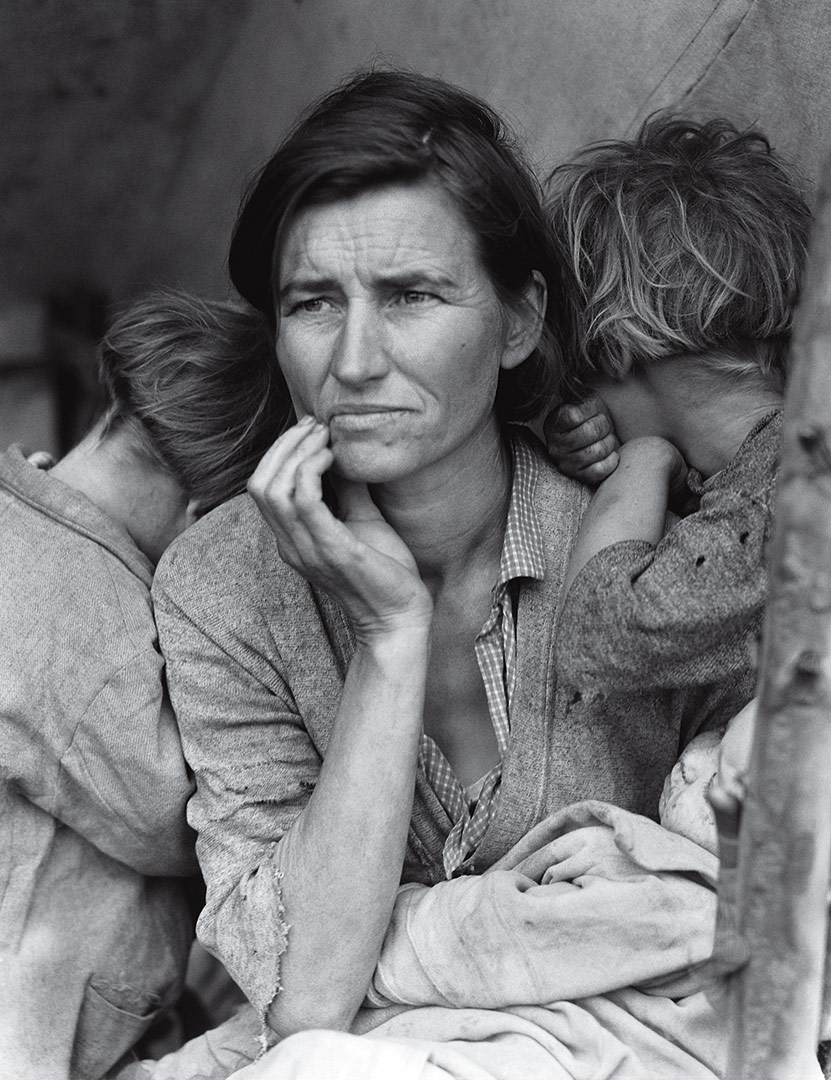
For many years the photograph Migrant Mother by Dorothea Lange was heralded as great American art. Then someone determined that Ms. Lange, horrors of horrors, positioned herself to exclude elements in the frame and may have coached the mother’s positioning. When I see the basement critics now disclaiming this as a work of art because of this, I realize that this is a case where a presumed rule is destructive. For interest, at no time did Ms. Lange every say that the photograph was unposed or uncropped. Someone somewhere decided that it was “pure” and when it was learned that she did work on the image in camera and in the field, she received enormous criticism from people who were not even alive when she produced the work. The internet is a wonderful place for fools to breed.
Migrant Mother by Dorothea Lange - this image is copyrighted and used for illustrative purposes only
In this iconic image, many of the so called “rules” are broken because it is the story that is important, not the “rules”. Amongst the broken “rules” are posing, exclusion, out of focus foreground elements, selective processing (dodging and burning). Not one of these rule breaks matters at all in the greater context of the story being told.
Other Rules
My good friend, acclaimed photographer Rick Sammon has a number of what his friends call Sammonisms. Rick is a great educator as well as a great photographer and he uses these Sammonisms as coaching tools for his students. A well-known Sammonism is “dead centre is deadly”. I use this with participants in my mentor programs all the time because in most cases, an image with the subject in the dead centre is boring, lacks story and does not lead the eye and becomes uninteresting. But could there be times when dead centre placement is ideal to communicate the intent of the artist? Certainly, it can be.
James Dean - image copyright Dennis Stock, Magnum 1955
You may have seen this iconic image of the late actor James Dean, shot in New York by Magnum photographer Dennis Stock. You could say that it obeys all the rules. Yet the original image did not, nor did the so-called “pure” image make it to the page unadulterated. Allow me to show you.
Copyright Dennis Stock / Magnum 1955
On the left, we see part of Mr. Stock’s contact sheet. We see that he made many images to achieve the one that was used. In fact, as part of his artistic process, most of the images had Mr. Dean as the central point of the image, emphasizing his strength in the context of the city. It was the Art Director who chose the offset image.
We can also see in this next image how much was done in terms of lab processing to change what was shot into what was printed.
All the images used in this article are protected by copyright and are used for educational purposes only.
Conclusions
Whether we choose to call them rules or guidelines or suggestions is just semantics. What matters is how we choose as artists to interpret them. Do we follow by rote, or do we interpret and apply or not apply as we deem appropriate based on our own art? I’ve only touched on a couple of rules because they are only examples of what others have defined as what is right. Only you can decide whether to leverage them or not. Critics of the day slammed Thelonius Monk’s style of playing and they often referred to Miles Davis as trying too hard to be Dizzy Gillespie. These opinions were promulgated so frequently that people who had never heard the music accepted them as facts, or what we call rules. This is unadulterated bullshit of course. Other folks, who never read the critics, were not influenced and made their own decisions. I love the work of Monk and Davis in general, but there are pieces that I do not like and that’s no one’s concern but mine.
As an artist you choose to let a critic or self-appointed photo judge define you, or you choose to trust yourself. It is your decision, but I will always vote for the latter. Make images that please you. Process them as you prefer. Make composites as you wish. Don’t let semantics get in the way. Go make images that please you and process them as you like. You’re right. And, if you change your mind later, you’re still right.
Do you have an idea for an article, tutorial, video or podcast? Do you have an imaging question unrelated to this article? Send me an email directly at ross@thephotovideoguy.ca or post in the comments. When you email your questions on any imaging topic, I will try to respond within a day.
If you shop with B&H Photo Video, please consider doing so through the link on thephotovideoguy.ca as this helps support my efforts and has no negative impact whatsoever on your shopping experience.
If you find the podcast, videos or articles of value, consider clicking the Donation tab in the sidebar of the website and buy me a coffee. Your donation goes to help me keep things going.
I'm Ross Chevalier, thanks for reading, watching and listening and until next time, peace.


