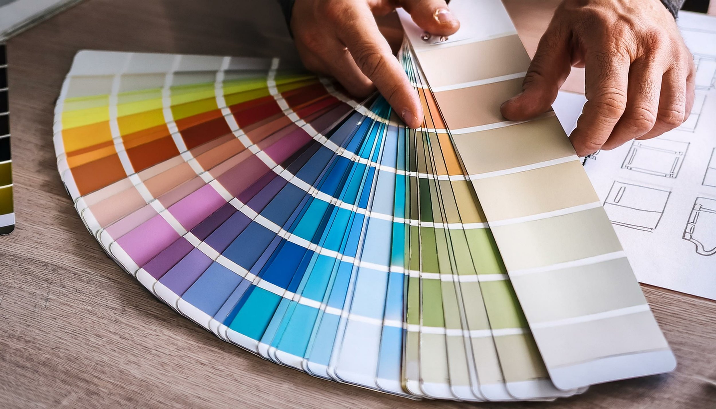
Changing Mood with Tint and Shade
/Hello folks,
In the last article, I talked about the separation of luminosity and colour and we looked at how colour influences mood. I expect that most of you felt that it was a bit more complicated than that, and you are correct because at that level, we do not take into account the impact of tint and shade.
In colour theory, we understand that white and black are not colours at all. Black is the definition of no light at all, and white is the definition of all primary colours at the same density and luminosity levels. In simplistic 8 bit RGB parlance we say that black is 0, 0, 0 and white is 255, 255, 255. Nothing earthshattering there.
However white, when “added” to a colour where the primary colour luminosity basic RGB scales becomes greater than 127, for example 135, 135, 135 we say that a tint has been applied. If we think of this in paint terms, while the primaries in paint are different, it just means that white paint has been added to the core colour.
Similarly if black is “added” to a colour value where the scale falls below 127, for example 102, 102, 102, we say that a shade has been applied. Going back to paint terms, it means black has been added to the core colour.
This tells usclearly, that any colour where the RGB values are not identical is in fact a different colour, because the individual RGB contributions are different. Even in the very simple RGB model, delivered by all compressed formats and most all displays that is still 65, 536 potential unique colours, more than science tells us that the average human eye can resolve and does not take into account other optical or ocular effects that will change the perception of colour. An example of this last statement is eggshell paint, a popular paint colour. Depending on the colour temperature of the light hitting it, it appears as very different colours. This is why concerning yourself about specific RGB values is pretty much a waste of time, unless you are a printing house or graphics professional where part of the success is measured on using the brand’s specific RGB colour. All major brands have colour palettes that are very specific and service providers must deliver to those exactly. However, if you are not doing that kind of paid work, you may be worrying about something of little to no impact.
So if I “add” white to a colour in light, I do so by an even increase in luminosity. Doing so one creates a new colour albeit with identical R G and B values that looks lighter and perhaps brighter. As more white is “added”, the colour crosses into pastels and then into very light fades. Think of red moving through “regular” pink to pale pink to a pink that has almost no visible red in it. This is how tint works.
The opposite involves not adding black but by taking luminosity away. So as we reduce the luminous values equally across the R G and B channels, the colours first become more saturated, then deeper and finally to the point where they are black with some tiny semblance of visible colour
All very fascinating but what has this to do with mood. If we go back and review the impact of subjects that are all white or all black, the mood characteristics of both are now coupled with the mood characteristic of the core colour. Adding tint creates a ligher feel, less gravitas and more freedom. Adding shade creates weight, solidity, gravitas or importance and more restriction.
Just as different people interpret different colours very differently, this is increased when we use tint or shade to modify the core colour. How one person feels when looking at a light pink could be very different from another person. The same will be true about two different perspectives from two different people viewing exactly the same green made darker by the application of shade.
Most humans see in colour and so most viewers of images are influenced by colour. People make an unending number of photos of sunsets, because the colours please them, and while much is lost between the real thing and the image on screen or on paper, a mood is created. However, there are others who see these images and do not feel anywhere the same thing as the person revelling in the sunset.
As an artist, you create work that pleases yourself, first and foremost, unless you voluntarily undertake work to another person’s rules. However, you can also create points of mental influence through the use of colour and extend that substantially through the use of tint and shade.
In the end, it really is, all about the light.
Please become a member on Patreon to help support this channel. A big thanks to all the existing Patreon members! Send in comments or questions, I read and respond to all. If you shop with B&H Photo Video, please use the link on the main page as it pays me a small commission and does not cost you anything to do so. Thanks again and we will see each other again soon.


