Your Very Own Time Machine
/This post discusses your personal time machine, it’s validity and potential for future impact
Read MoreWelcome to The Photo Video Guy. I share training, ideas, opinions and tips to help you make better photographs and videos.
Have questions? Excellent! Please click this link to fill out the simple form to submit a question
This post discusses your personal time machine, it’s validity and potential for future impact
Read MoreIn this post I discuss the use of textured photographic papers, mattes, mounting and display
Read More
Hello folks,
It’s been a minute since you’ve heard from me. Here’s where things are.
I’ve had respiratory issues all my life and for the last four months or so have had increasing challenges breathing. The numbers looked ok but I couldn’t get air in. Long boring story, I suffered complete respiratory failure on Dec 11, 2025 and was only released from hospital on Jan 2, 2026 and while I am much better, the recovery period will take time I am told.
Lack of air impacted content creation but so too did my thinking on the subjects of photography and video. I no longer think about gear at all, and rarely even about post processing tools. I am almost entirely focused now on the craft of image creation and story telling.
This means that going forward I will be breaking the rules of modern media. I will be delivering less volume, but I hope more rich content. I am told to post several times a week, but more is never the same as good.
Thanks for all your support and I hope that you stick with me as we move ahead. If you have ideas or questions, please send them in. If it is of interest to you, time has proven it is likely to be of interest to others.
Cheers!
Ross
If a photo is not finished until it is printed, prints are incomplete until they are in a photo book
Read MoreFilm photography is not just a trend, it’s an alternative route to the craft of photography that involves you the creative far more than digital can
Read MoreThere’s a new release from Affinity. Fully integrated apps. No subscriptions. Completely free. Holy Moley!
Read MoreAn image with the subject dead centre is generally a bad decision, yet it happens all too often. Consider “why” it can be so bad and what you can do to change things.
Read MoreLearn how to use your tripod as a compositional tool
Read MoreWhich has the greater impact, the lens or the camera? It all depends on your goal
Read MoreEisenstadt was right. Images are all around us.
Read MoreMake better fall colour images by not doing the same old, same old.
Read More
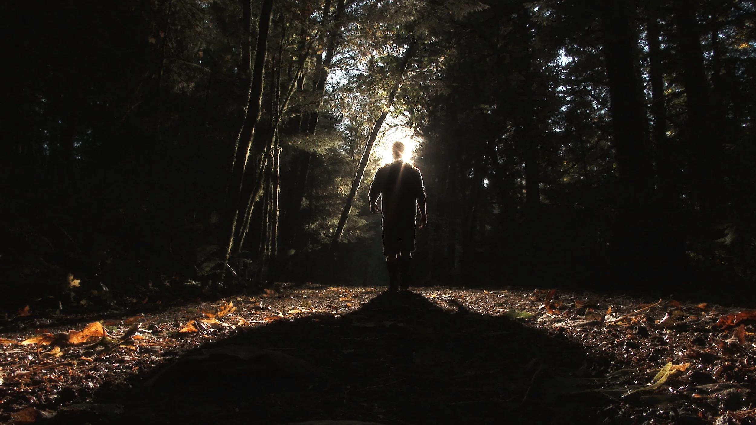
THis image is underexposed by intent to create a sense of mystery and potential danger. Not what the meter wanted
Hey folks. I recently got to review a post-live conversation on the topic of “the right exposure”. I sincerely regret not having my Wellingtons on (high rubber boots for those unclear). I say this because it got quite deep and smelly very fast, kind of like you might find in a muddy pig pen. This is not a slur against pigs, they are what they are and are both quite delicious and superb for getting rid of a body, but that’s a different subject entirely.
The vast majority of the dialog kept running in an ever decreasing circle of the alleged exposure triangle. I say alleged because while the three primary exposure variables all work together, they are not locked together in a consistent relationship. Although a surprising number of people seem to think that they are.
So let me define what I see as “the right exposure”. As this is my opinion, based on my experience and study, it is not a fact per se, and no one is under any obligation to agree. If you don’t that’s cool, but there’s no need to expend your time to tell me that I am an idiot.
The right exposure, in my consideration, is the one that a) best serves the story you are desiring to tell in your image and b) makes you happy. Now if you don’t care about telling a story with your image, it’s a snapshot and has no bearing here. And if you think an exposure is perfect and hate it, perhaps a different person could assist you better.

By overexposing, the creator has made the background irrelevant and put more brightness in the eyes and face. This is not what the light meter would have proposed.
How does an exposure serve the story? First you have to have a story and sadly most of the dreck that gets posted couldn’t spell story with Vanna White putting all the letters in order, let alone tell a story. All stories have at least a primary subject, contextual background and a setting. Fortunately because you the creator have the control, all these things are at your control. If you make an image and find that the story is not as light as you might like, you might consider a slower shutter speed to introduce a tiny bit of motion blur. If your story is clinical, you might alter the aperture to provide more than the expected depth of field. If your story is meant to evoke classical documentarys, you might raise the ISO to where you get digital noise with intent, then convert to black and white and add digital grain. You might choose to overexpose to make your colours more pastel or watercolour like. You might choose to underexpose to crush the shadows and create a more sinister feel to tell your story.
With respect, if all you do is just accept what the light meter RECOMMENDS, then you may not be supporting your story as best you can. The only right exposure is the one that fulfills your story goals, whatever they may be.
Please become a member on Patreon to help support this channel. A big thanks to all the existing Patreon members! Send in comments or questions, I read and respond to all. If you shop with B&H Photo Video, please use the link on the main page as it pays me a small commission and does not cost you anything to do so. Thanks again and we will see each other again soon.
Do you find some of your images are too flat looking? Join me to find out why and how to make things better
Read MoreIt may be time to review how you think about and use composition in your images
Read MoreHere’s a real challenge. Make images from the subject’s perspective, particularly when the subject is not human.
Read MoreIf it’s too hot to photograph outside, come in and do this lighting class
Read More
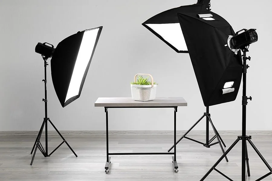
image copyright improvephotography.com
Everyone knows me as the flash guy. I use flash whenever I can find a way to make an image better using supplemental light. It’s got more power relative to its size than anything and getting a great flash exposure whether on camera or off is so easy.
Except…
A concern I continue to hear from folks learning about lighting, is that they won’t know the impact until after the image is made. When I was shooting film, I could better understand this, but we can all see the impact of flash right after squeezing the shutter release.
However…
Let’s say that one is focused on better learning the use of lighting and leveraging its three component factors, distance, colour and quality. While all are possible with flash, one does have to make an exposure and then review it to really see the impact and that can be hard on a small LCD.
To aid in learning about lighting, I am inclined to recommend a continuous light source but one that can be manipulated like and that uses the same light shaping tools as a flash.
As learning and study are not time or portability dependent, I propose an AC powered continuous light that takes standard light shapers. I use Godox continuous lights that have the industry standard S mount for light shapers, aka the Bowens mount. The Godox lights have proven super reliable, very cost effective, have excellent colour control and are well built. The S mount means that one can get a few light shapers that fit without going bankrupt. The 100w SL 150 is an excellent choice that serves your skills development and also practical work.
I do recommend getting as much output power as you can afford, so you can maintain more depth of field, higher shutter speeds and lower ISO as your needs demand. While no continuous light is really powerful enough to freeze moving subjects, they do work for statics, product shots, flowers, and even pets and people if they aren’t bouncing around.
The example image from improvephotography.com is a superb example of what a three light continuous light system would look like. We see three lights on stands, each with its own light shaper, positioned to place the light where the photographer desires, using distance and output controls to set the lighting ratios to achieve the goal.
You can of course do math for lighting ratios, but I recommend playing around and trying different positions as that is far more useful than worrying about whether you have a 4:1 ratio, or something. Long experience shows that moving a light changes the positioning of highlights and shadows and you can see the change right in the viewfinder in real time. It’s quick, it’s easy and what you see is what you get.
In reality, I recommend starting with only ONE light. First, it’s less expensive, second it is least complex and you will see the impact of the light and the light shaper immediately. Do get the light as close to your subject as you can, because while it looks really bright, it actually isn’t and if you want lots of depth of field, you’re going to need all the power that you can get.
Choose a subject with dimensionality. Could be the bowl of fruit that my new students start with because there are lots of textures, light spots and shadows and a healthy snack all involved. Flowers work, and if you have access to children’s toys they are also excellent subjects. A set of salt and pepper shakers work well too.
I’m going to recommend not using highly reflective subjects such as glassware or wine bottles at first because the reflection management gets in the way of the lighting learning. You certainly can if you wish, but they do add complexity to your work.
Don’t expect world class advertising images, or big prints. This is class work, even if you are a class of only one. Make notes for each image, not just the exposure settings, but more the light setup, maybe use your phone camera to snap images of the overall setup and then link them altogether in your skills development book. It’s important during review to not just look at the final image, but what you set up to achieve it.
Please become a member on Patreon to help support this channel. A big thanks to all the existing Patreon members! Send in comments or questions, I read and respond to all. If you shop with B&H Photo Video, please use the link on the main page as it pays me a small commission and does not cost you anything to do so. Thanks again and we will see each other again soon.
A huge thanks to all who sent in ideas on getting out of a photographic doldrum
Read MoreWhen the photography doldrums hit, or you are not engaged in your creative pursuits, share ONE thing that you have done to get over that hump.
Read MoreGetting out to shoot around sunrise and around sunset on the solstices gives you an opportunity to see amazing light in a relatively short period of time. Are you doing this? You should be.
Read MoreThe site of The Photo Video Guy featuring articles, reviews, tutorials and a podcast for your enjoyment and skills development.
If you get value from here, please support the channel on Patreon. Once there, click Membership
Looking for something in particular? Search all the posts for the content you are seeking!
Have a question on photography or video? Click this link to send us your question.
Subscribe to our articles via RSS by clicking the link below.
Subscribe to the Make Better Photos and Video Podcast via RSS by clicking this link
Regular readers know that I am a big fan of Really Right Stuff products. Their customer service is superb. If you choose to purchase from them at their site, please let them know that I referred you.
The Photo Video Guy is the creation of Ross Chevalier. Please feel free to link to your site, but please don't lift content without attribution.